As I Understand It

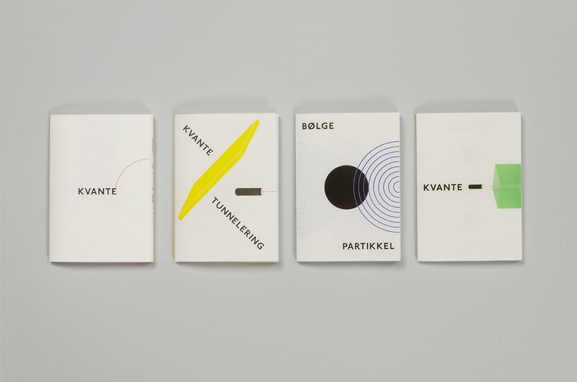
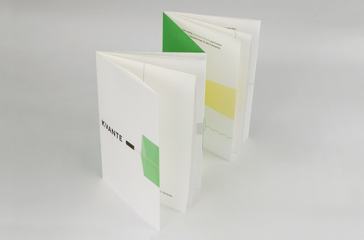
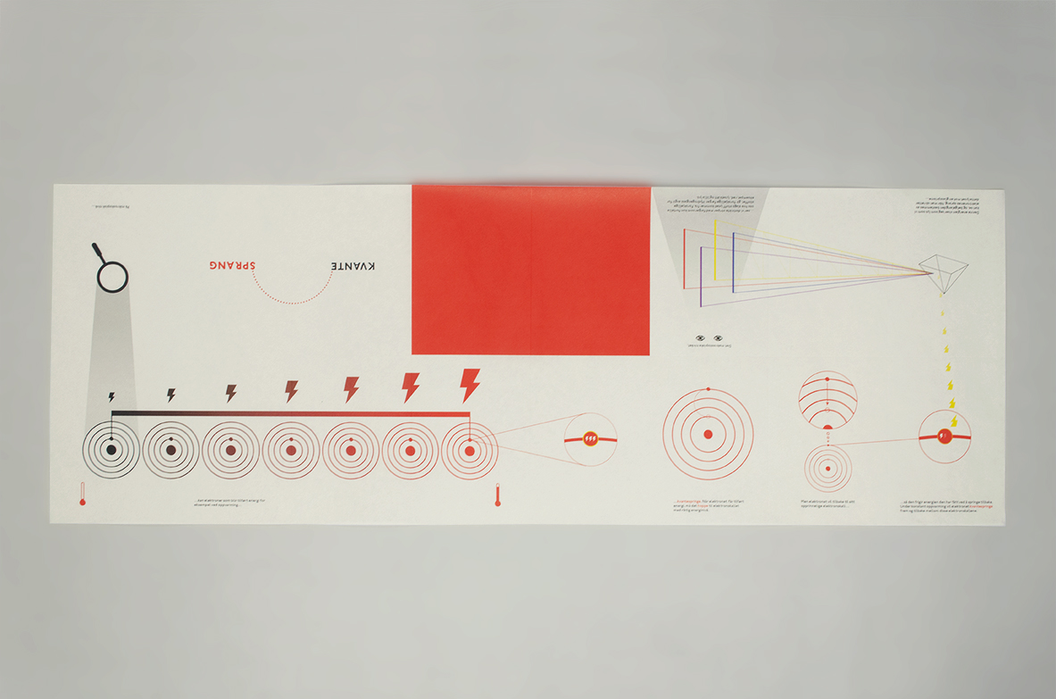
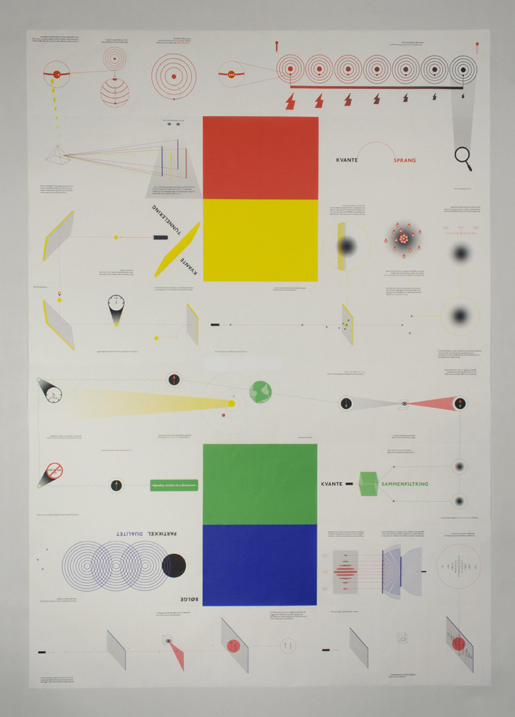
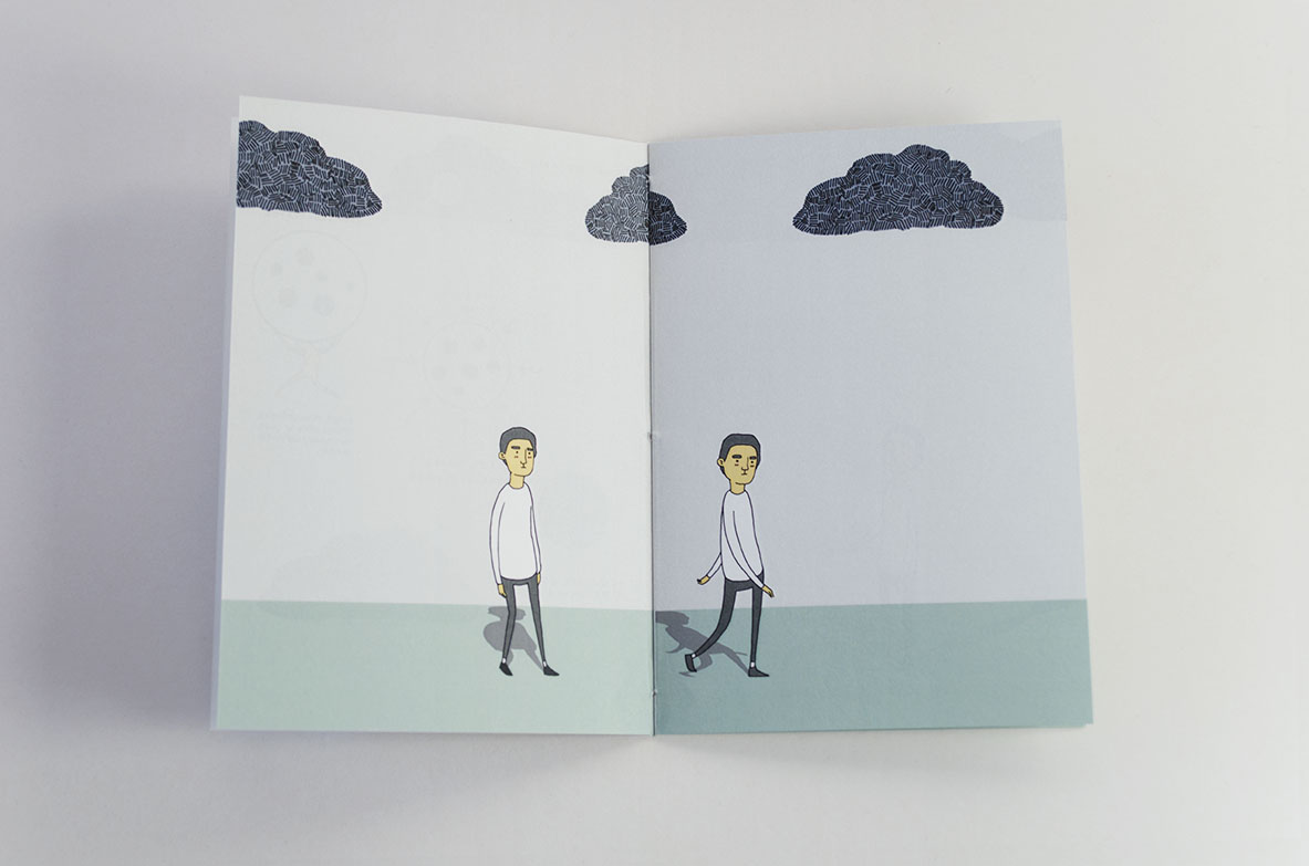
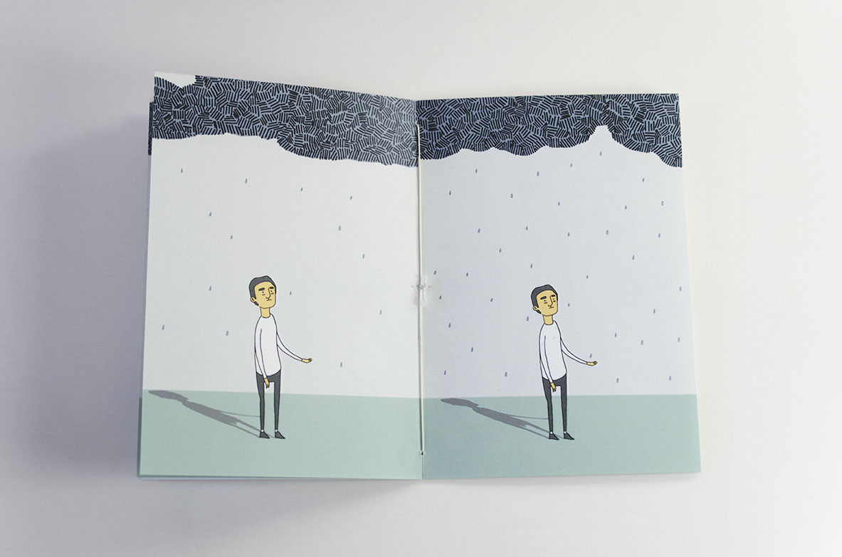
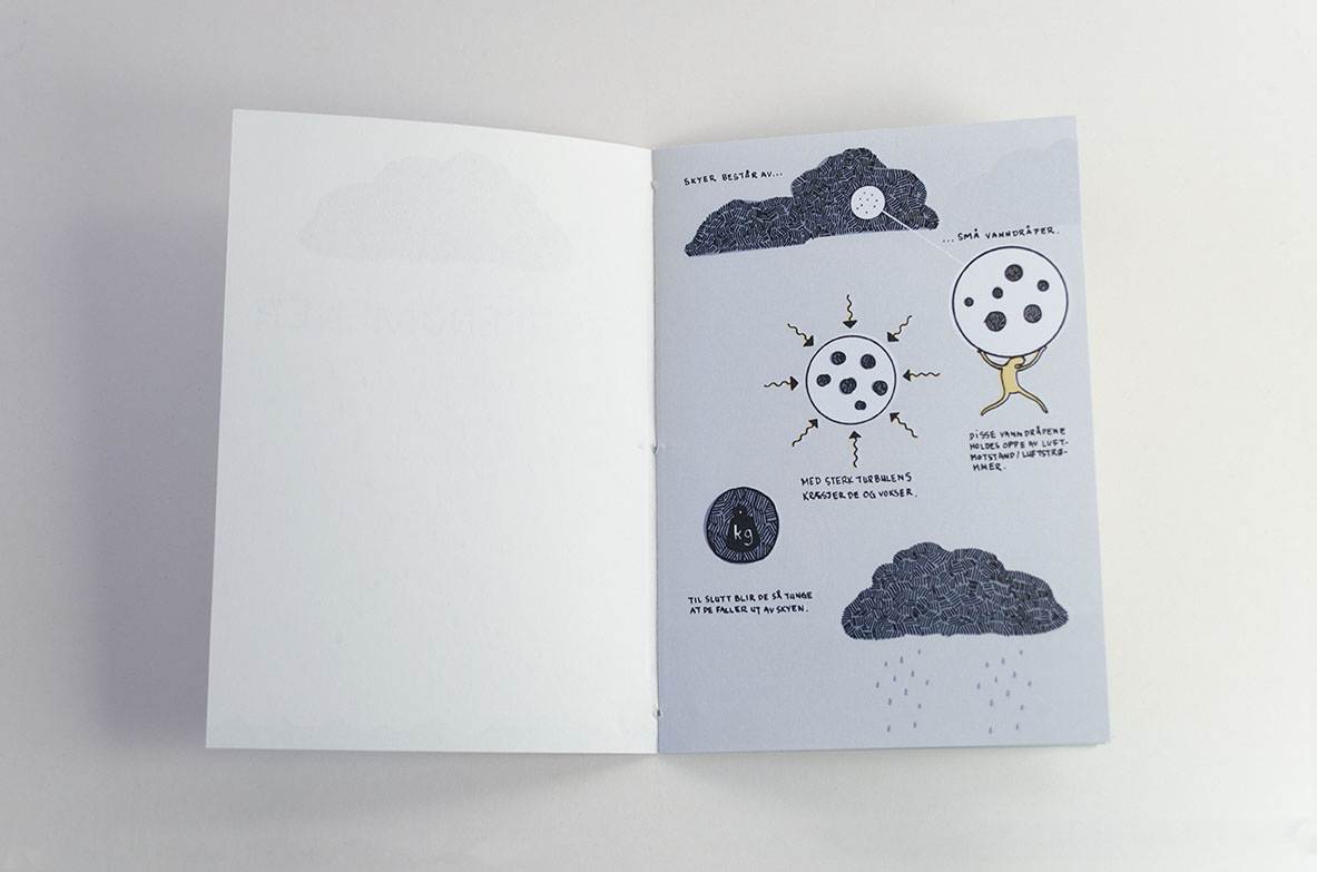
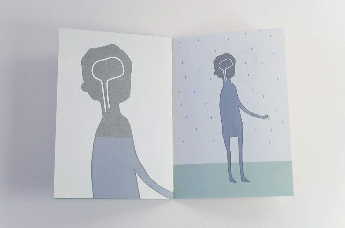
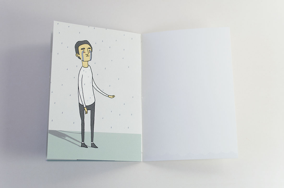
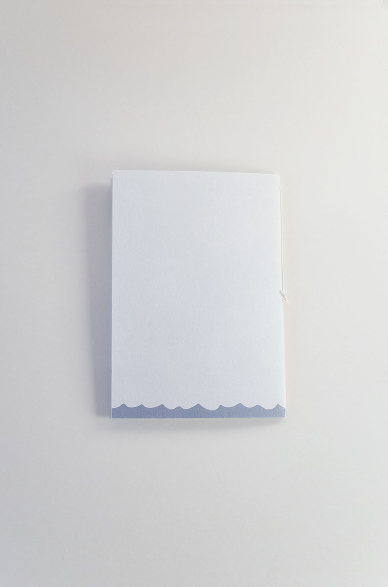
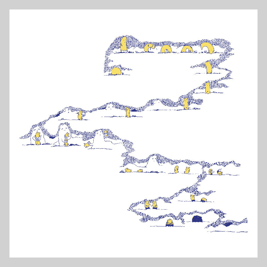
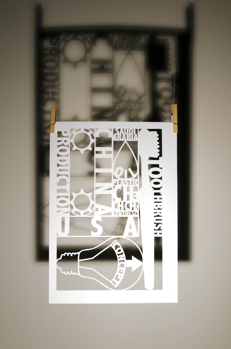
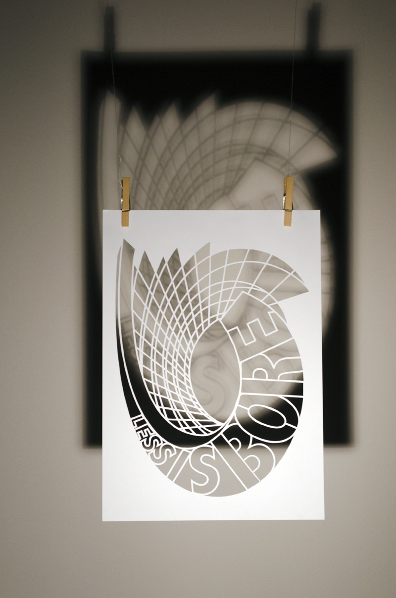
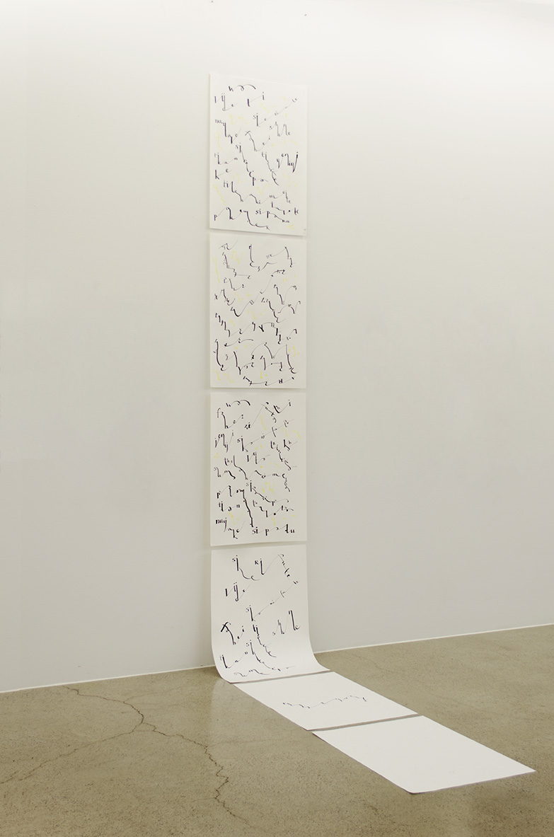
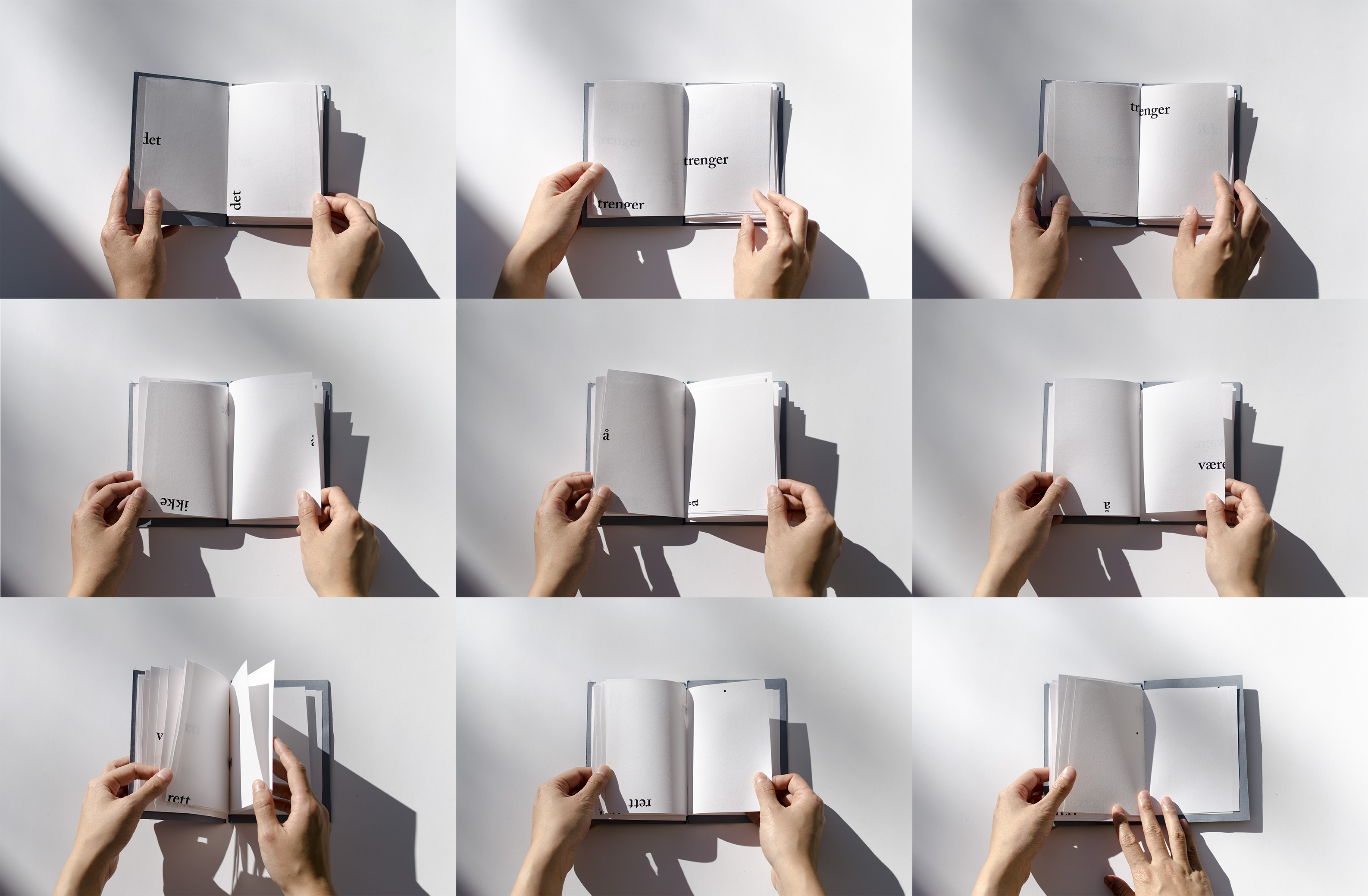
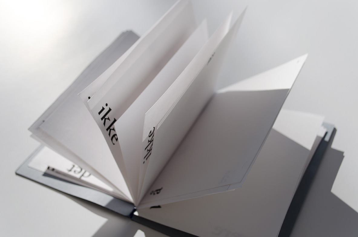
My bachelor’s project, As I Understand It (Slik jeg forstår det), is about explaining four quantum mechanical phenomena to the audience by emphasizing visuals and the graphical narrative using as little text as possible. The exam consisted of a finished product, a presentation of the project and exhibiting the result.

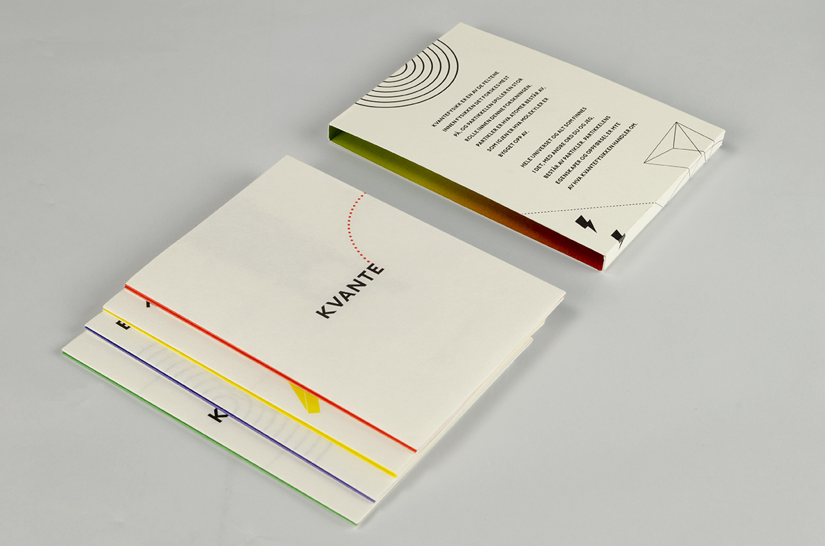
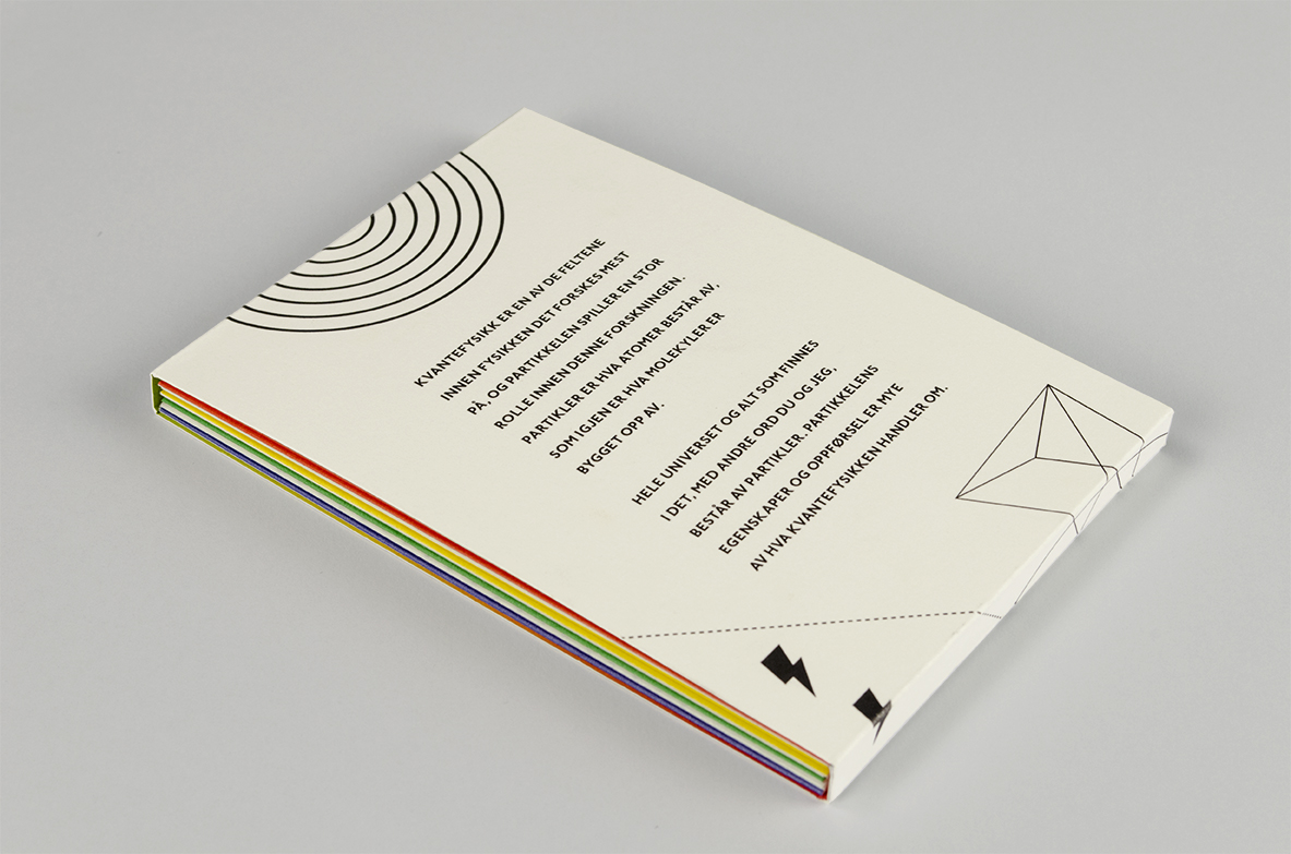
In 2016 the project was nominated and received a diploma in Grafill’s competition, Visuelt.

The jury’s comment:
The passion for the subject evidently shines through and rubs off on the jury. Some of the most advanced and incomprehensible subjects in science explained so simply it almost seems banal. Quantum physics suddenly feels very simple, but gets inconcievably complicated again when you try to fold the pamphlets back together. That the parts combine into a poster, gives the project a great added dimension.

One Inch Punch

In my master’s project from the Oslo National Academy of the Arts I have explored my interest in martial arts. I wanted to show aspects of martial arts through graphic design and illustration. The subject was the legendary and controversial One Inch Punch, made famous by martial artist and actor Bruce Lee in the 1960s. In short, the point of this punch is to generate a large amount of force in a short distance, in this case one inch. The goal of the project was to find a design that would catch the audience’s attention and could spark an interest in martial arts in others.

The result is an installation consisting of a selection of collected videos and a self-made animation projected onto a white cube using projection mapping. The cube shows different sides of the punch that interested me. Clips in black and white show various martial artists performing the punch in their style, including Bruce Lee’s demonstration. The animation, in colour, is based on scientific findings and explains in detail how to perform the punch. The videos and animation are cut and composed to be as short and concise as the punch itself. On two sides there is no projection, but in its place an introductory text in English and Norwegian.

Mole Destiny

A small project based on research on moles. There exists a Chinese superstition that the placement of a mole on one’s face, could determine your destiny.

People can identify their mole on the cover, and then find the page. Red means something bad and green means something good.

On the back, you find the ABCDE signs of melanoma to tell whether your mole is actually benign.

The Norwegian Institute for Children’s Books

A concept for an exhibition for The Norwegian Institute of Children’s Books and their research. It had to be possible to mail to all the libraries in Norway, and not take up too much space.

The idea is to make the research text more available to people by having a teaser text from the research on a transparent dust cover that is put on the related book. There would also be a hanging mobile with a poster for the research subject, this time it was the 200 year jubilee of the Norwegian institution with pictures of researched books.

Studentmail

A week-long infographic project which we had to base on a data set from our school environment. How many relevant emails do we get? When do we get relevant emails? I got these data from my student inbox over the course of one semester at the Oslo National Academy of the Arts. The infographic shows when I get most emails, how many relevant mails I got and at what times I am more likely to receive emails worth reading.

When & Where

Screen printed poster made in collabaration with Ida Bakken for a one-time event that took place Friday December 11th 2015. The event was a collaboration between design master students and students from the Norwegian Academy of Music. The elements in the poster were to mirror the layout of the room at the time of the event.

Photo by Ylva Greni Gulbrandsen.

Wishbone Chair

Screen printed poster of Hans J. Wegner’s iconic Wishbone chair for Carl Hansen & Sons showroom.

Tage

Business card for musician Tage Lægreid Olsen, printed with a risograph.

Looking for Someone

Workshop med illustrator Dominique Goblet.

Happy Families

Workshop were we had to interpret the families in the traditional card game Happy Families with familiestructure that exist in modern Norway. All the participents in the workshop got to make one familiy each.

36 days of type

A short online project called 36 days of type which happened on instagram. 1 letter per day in 36 days. I made 20 av 36 days.

Weather Phenomena

A week-long illustration workshop with illustrator Anna Fiske. The theme was weather, so I made a small leaflet with a story mixed with fact and pseudo-facts about weather phenomena.

Forest Monster

The Blob came to be during an illustration workshop with Øyvind Torseter.

The Top of the Calabash

The tumblr-blog Top of the Calabash was created during a workshop held by graphic designer Ian Brown. We got to choose an item from a table, I choose this thing that proved to be the top part of a calabash.

The website works best in its desktop version.

Paper Cutting

Paper cutting and shadows, the paper cutting is done by hand.

Lorem Ipsum

A two-week workshop where we got short introductions to western calligraphy, chinese calligraphy and grafitti. These posters is based on some of the techniques that we were shown that I wanted to try out. The text itself is based on a subjective interpretation of a text written with three different phonetic scripts, the way the text is written is supposed to represent the tone of the word.

It Need Not Be Right

Workshop in book binding, where we had find a mantra this book could remind us of during our design practice.

Illustration